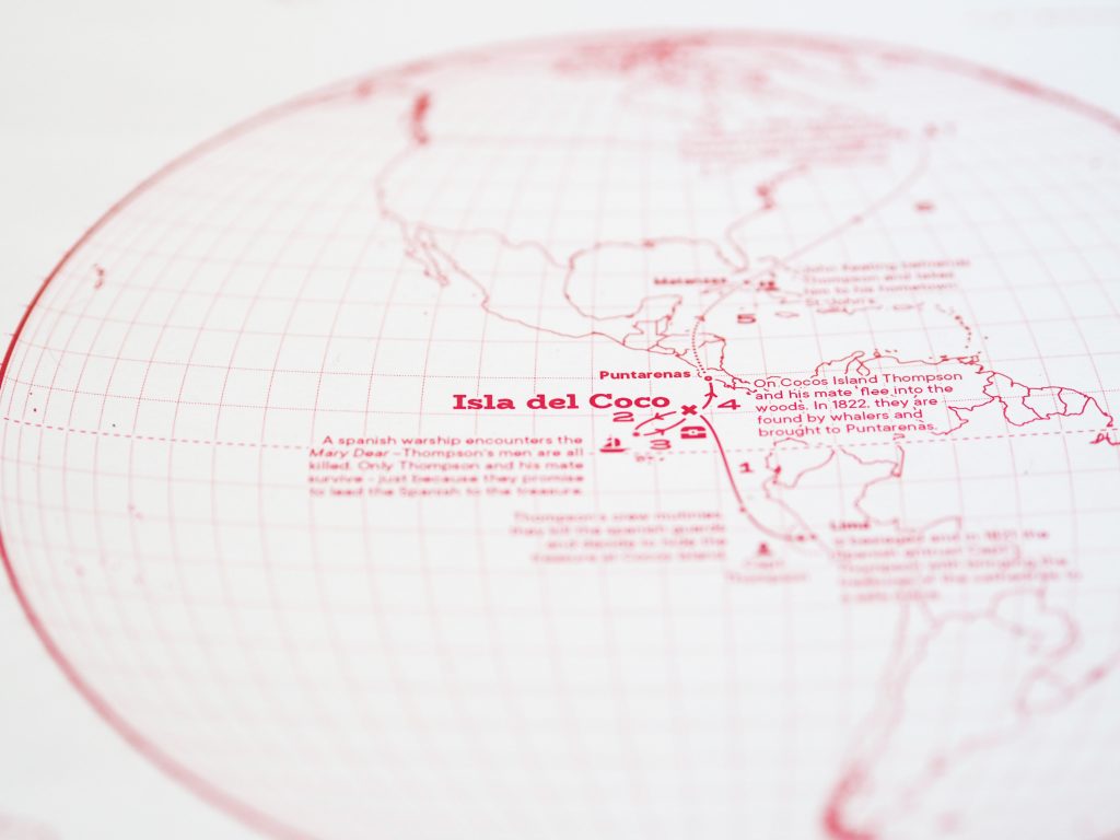
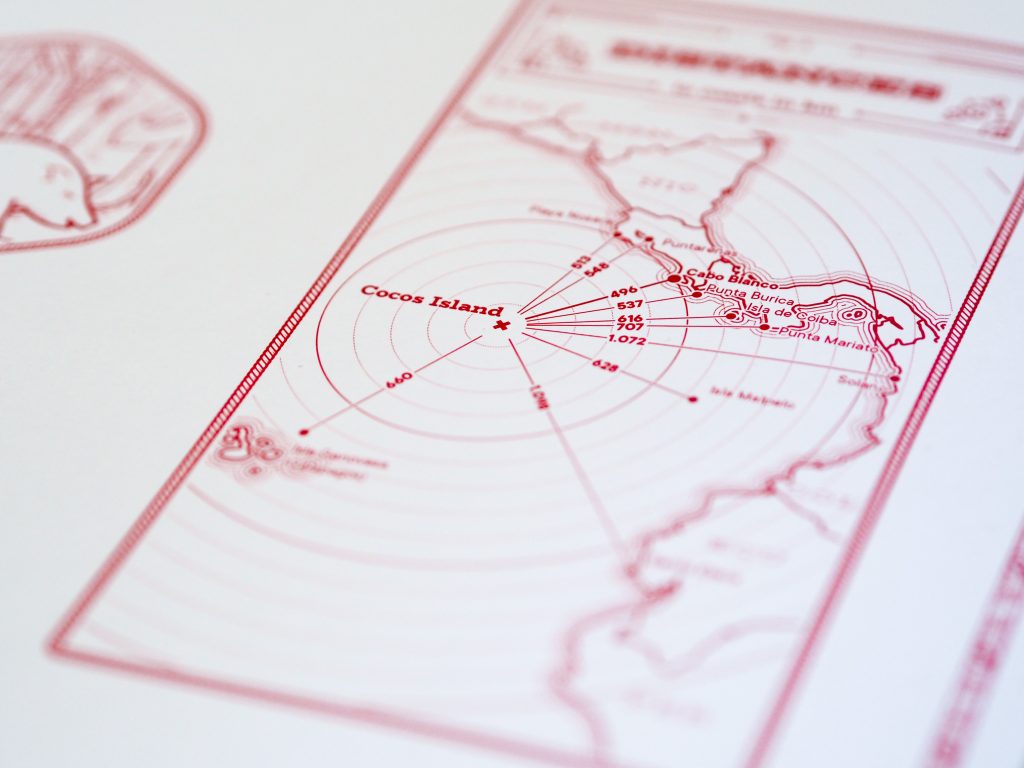
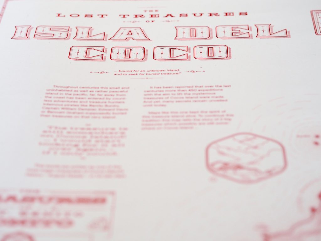
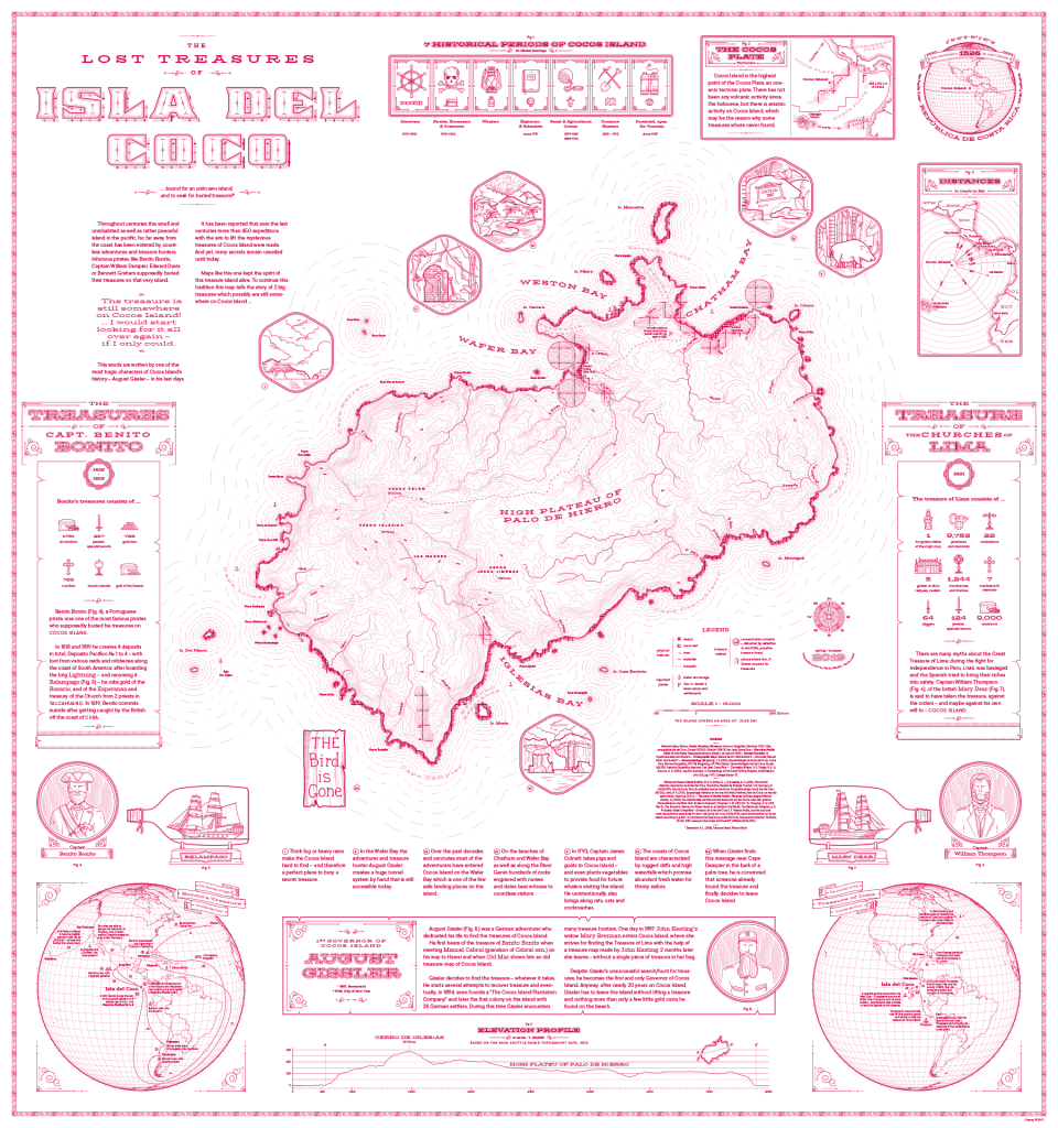
We congratulate our student Jakob Listabarth for being a winner at the Monochrome Mapping Competition 2019 with his purely magenta map “The Lost Treasures of la Isla del Coco”, which he created within the class Project Map Creation this summer semester.
From the jury statement:
When doing monochrome design, cartographers can only use one “ink” color, but most of us at least use various tints of that ink: basically, mixing it with the background color to create a continuous ramp of colors (e.g., greyscale) that we can use to distinguish rivers, contours, and other feature types from each other. Continuous monochrome is tough enough, but Jakob Listabarth takes the challenge even further and uses this map’s sole ink at 100% strength only. He is only able to distinguish feature types from each other using line weight, dot/dash patterns, and hachure shading. This he does excellently, and I continue to be impressed by how much information is shown, and how clearly each layer is distinguished from the others when they are all, after all, exactly the same version of magenta.
It’s not only an attractive aesthetic choice, but one that ties into the map’s subject. In the 19th century cartographers were usually likewise limited to representing features using ink lines, printed from engraved copper plates. Listabarth still puts a modern spin on things with the sans serif typography and charming (whimsical?) illustrations. It’s a lovely blending of old and new.
Daniel P. Huffman, competition Curator
Congratulations on your impressive work, Jakob!
