Great student projects, summer semester 2014

The summer semester is over. Once again, we would like to showcase a small selection of extraordinary projects from the classes Webmapping, Multimedia Cartography and Project Map Creation:
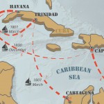
Preview of the map Historic Centre of Granada by Francisco Porras Bernárdez, Project Map CreationPreview of the map of Humboldt’s Expeditions in America by Sigita Grīnfelde

A huge thanks to all students for their creativity and dedication – you brighten our work days! Good luck for your further studies and career!

Maps for the Austrian contribution to LaBiennale 2014

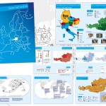
The Austrian contribution to this years Biennale is commissioned by Dr. Christian Kühn, professor at the Institute of Architecture and Design at TU Vienna. The subject of the exhibition is “Plenum. Places of Power” and showcases models of all parliaments of the world – in a scale of 1:500.

We are proud to have contributed a small aspect: Manuela created the country maps for the exhibition catalogue. The maps are equal area (Albers projections centered on each country) and are centered on the cities, where the parliaments are located.

You can skip through some catalogue pages on issuu.com:

Here are some details on how the 196 country maps were created: We used Natural Earth data (1:50m), which also include ISO country codes. These codes were used for merging the country maps with the data provided by the catalogue team. For creating the latitude/longitude lines, we used QGIS Processing and a small Python script written by Markus Mayr from the Geoinformation group. We then experimented with the Atlas feature from QGIS and Data Driven Pages from ArcMap. Both tools are extremely powerful for creating map series. While the usage of Data Driven Pages is really straight-forward, QGIS allows even more adaptation – with a slightly more complex setup. We ended up using ArcMap for the final PDF production, since QGIS doesn’t allow CMYK output yet. Of course, the PDF from QGIS could also be converted to CMYK later.

Anyways: It was a perfect task for trying out the map series functionalities of QGIS and ArcGIS. It’s good to see the growing set of features for cartography in QGIS. A big thanks to Markus Mayr and Werner Macho for their advise.

More details on the Austrian pavillon at LaBiennale 2014 can be found on labiennale.at.
The impressive visual identity of the whole project was created by buero bauer.

CartoTalk Dušan Petrovič: Cartography in Slovenia

We invite you to a CartoTalk [in English] by Dušan Petrovič of the University of Ljubljana on the topic of Cartography in Slovenia.

He will talk about the historical development of cartography on today’s Slovenian territory from 15th century, cartographic tradition in Slovenia and the establishment of cartographic systems after 1991 and their current status. He will also report on current cartographic research projects, research work and student’s products at the University of Ljubljana, Faculty of Civil and Geodetic Engineering.

Tuesday, 03 June 2014, 15:00
Forschungsgruppe Kartographie
Seminarraum 126

Ph.D. defense of Alexandra Millonig

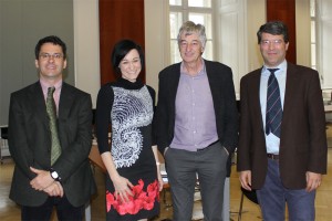
Prof. Kanonier, Dr. Millonig, Prof. Dangschat, Prof. Gartner

On 19 March 2014, our former colleague Alexandra Millonig successfully defended her PhD research on the topic of

„My Way – Towards a Typology of Pedestrian Spatio-temporal Behaviour in Shopping Environments“

Her examination committee included Prof. Georg Gartner, Prof. Jens Dangschat, and Prof. Arthur Kanonier. Prof. Kanonier chaired the examination committee.

Congratulations, Dr. Millonig!


Nice student projects

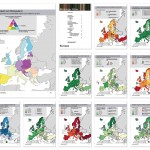
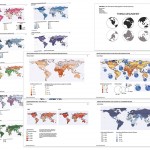
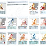
In der VU Thematische Kartographie in der Raumplanung (3. Semester) geht es um die Aufbereitung statistischer Daten und deren wirkungsvolle Umsetzung in thematischen Karten. Als Abschlussprojekt werden in Gruppenarbeiten Atlanten zu frei wählbaren Themen erstellt, wobei alle geographischen und statistischen Daten aus offenen Datenquellen (z.B. Open Government Data) stammen. Dabei entsteht jedes Jahr eine Vielzahl spannender Themenkollektionen und Visualisierungen. Einige der besonders gelungenen Arbeiten aus dem WS2013/14 möchten wir im folgenden vorstellen:

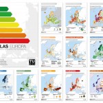
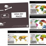
Energie-Atlas von Christina Grießler, Christoph Weber, Manuel Oberaufner, Anna Logar   Atlas der Macht von Julian Eros Behmer und Thomas Höllersberger   Bildungs-Atlas von Florian Maria Fasching, Sarah Steiner, Marvin Linke, Moritz Starzer und Veronika Schafellner
Gesundheit weltweit von Eva Mair, Isabel Zelger, Michael Gidam, Charlotte Heller und Christoph Singelmann   Meine Welt und ich – Kinderatlas von Thi Bich Ngoc Doan, Linda Liu, Balázs Cserpes, Kevin Schneider und Sonja List   Lebensqualität im europäischen Raum von Denise Goff, Maximilian Hejda, Waldemar Grunt, Solomon Gärtner von Srdjan Kuzmanovic

  • Energie-Atlas von Christina Grießler, Christoph Weber, Manuel Oberaufner und Anna Logar (1.8mb)
  • Atlas der Macht von Julian Eros Behmer und Thomas Höllersberger (13mb)
  • Bildungs-Atlas von Florian Maria Fasching, Sarah Steiner, Marvin Linke, Moritz Starzer und Veronika Schafellner (15mb)
  • Gesundheitsatlas von Eva Mair, Isabel Zelger, Michael Gidam, Charlotte Heller und Christoph Singelmann (37mb)
  • Meine Welt und ich – Kinderatlas von Thi Bich Ngoc Doan, Linda Liu, Balázs Cserpes, Kevin Schneider und Sonja List (4.3mb)
  • Lebensqualität im europäischen Raum von Denise Goff, Maximilian Hejda, Waldemar Grunt, Solomon Gärtner und Srdjan Kuzmanovic (7mb)

Auch wenn alle Arbeiten ein sehr positives Gesamtes ergeben, gibt es an der einen oder anderen Stelle natürlich auch noch Raum für Verbesserungen… Die Studierenden aus dem 3. Semester stehen dafür aber auch noch ganz am Anfang ihrer kartographischen Betätigung 🙂

Danke an die Studierenden für ihr Engagement und die Einwilligung zur Veröffentlichung!