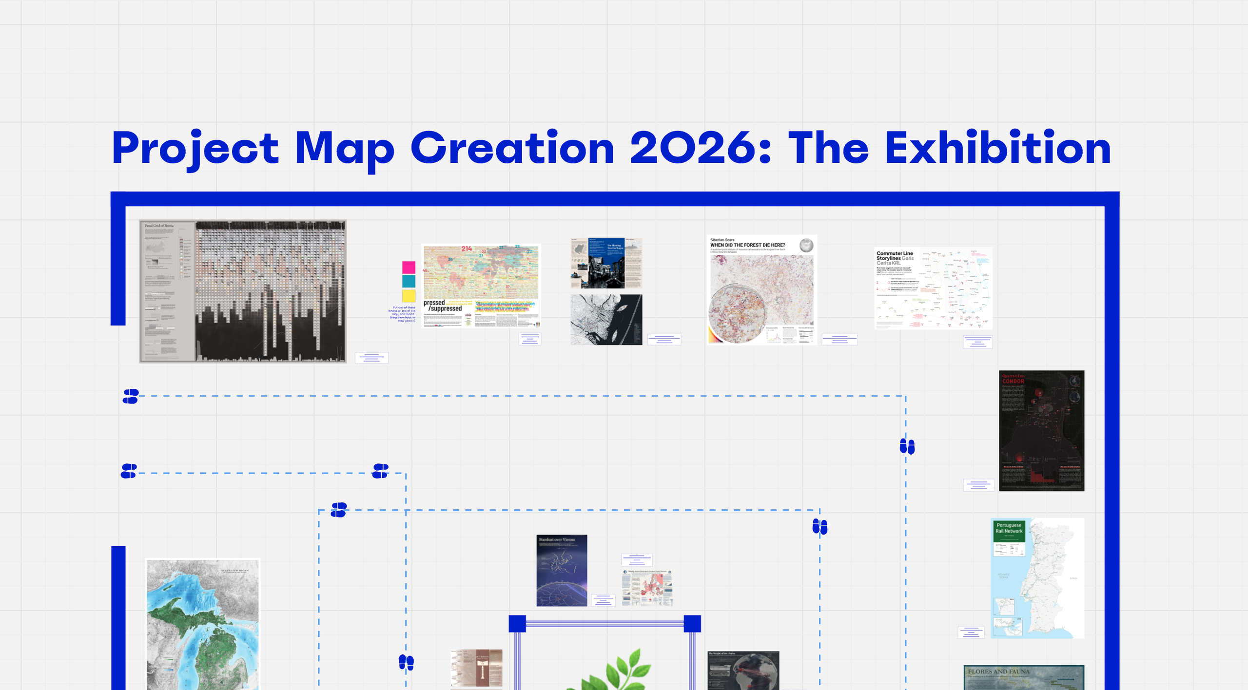
This year again, our cartography students have created stunning maps, as part of their course “Project Map Creation”. They had full freedom over the topic, data, software and techniques used. The results are truly impressive.
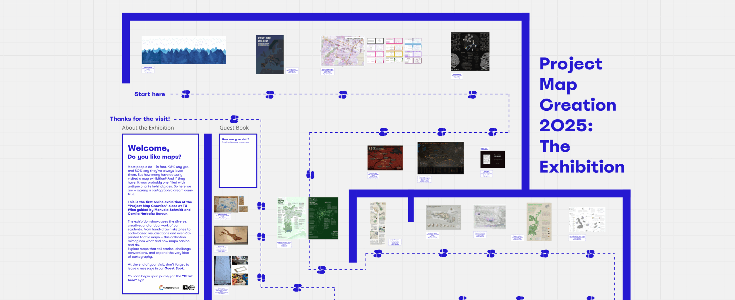
You can now see all of them online using this link.
Thank you to Camila Narbaitz Sarsur for setting up the exhibition!
The 15th intake of cartography students finished their semester! During the past 4 months, they have practiced many cartographic skills: web mapping, location-based services, theoretical cartography, graphic design, and many others. And they learned by doing, as this semester is almost fully assignment-based.
In the Project Map Creation course (supervised by Manuela Schmidt and Camila Narbaitz Sarsur), they had the chance to apply all the techniques they want to realize one big project, which they exhibited at the occasion of our yearly Map Exhibition on June 25th!
We celebrated the end of their semester, and their beautiful maps. It was a great moment — although we are of course always sad to say bye.
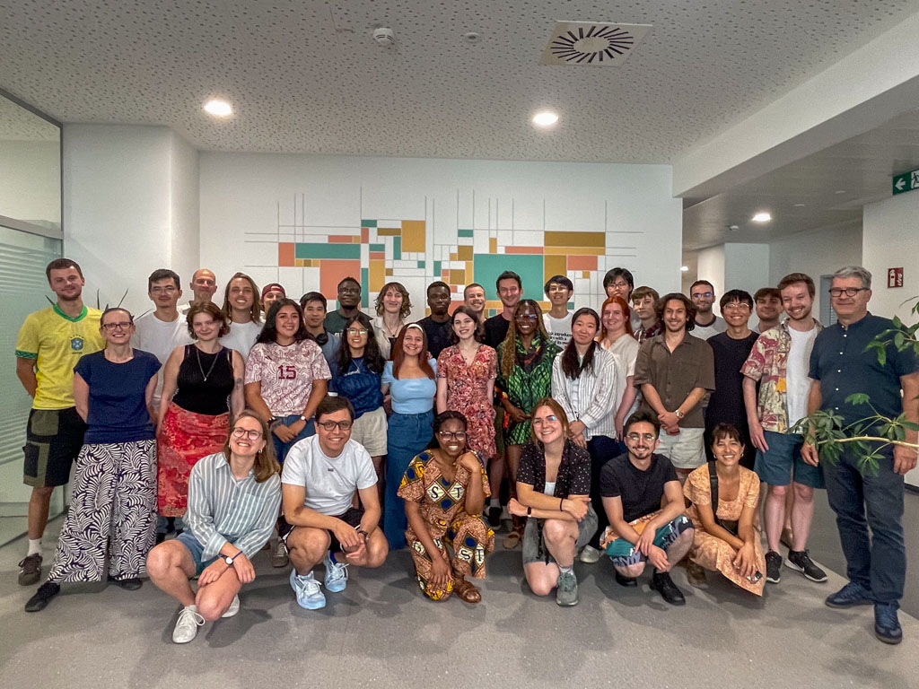
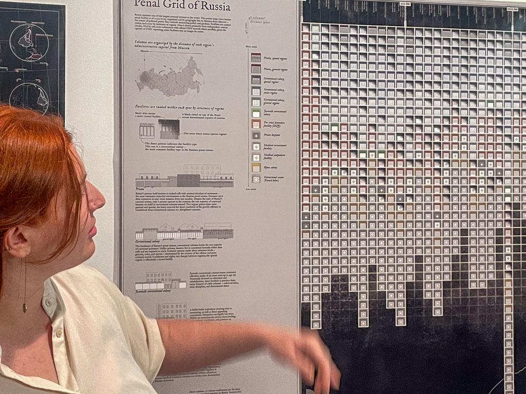
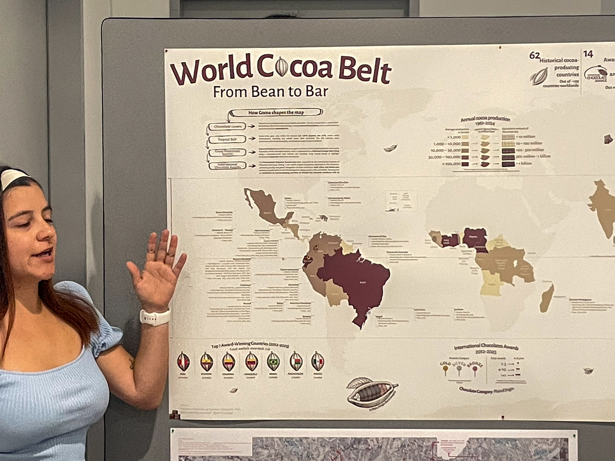
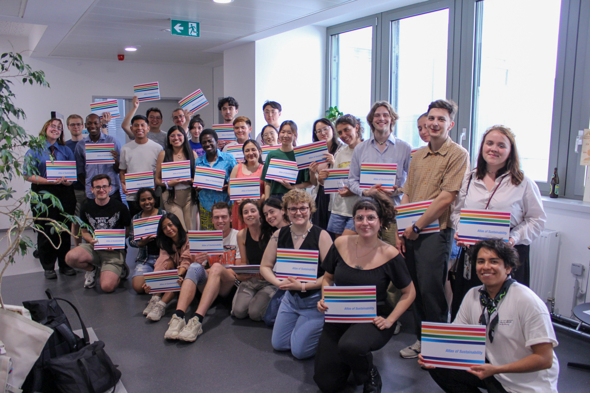
The students and some of the staff!Alena Avdeeva and her map “Penal Grid of Russia”Domenica Fernandez de Cordova and her map “World Cocoa Belt”
Their next stop, after a well-deserved summer break, is the Technical University of Dresden! We wish them a great semester and hope to see them soon.
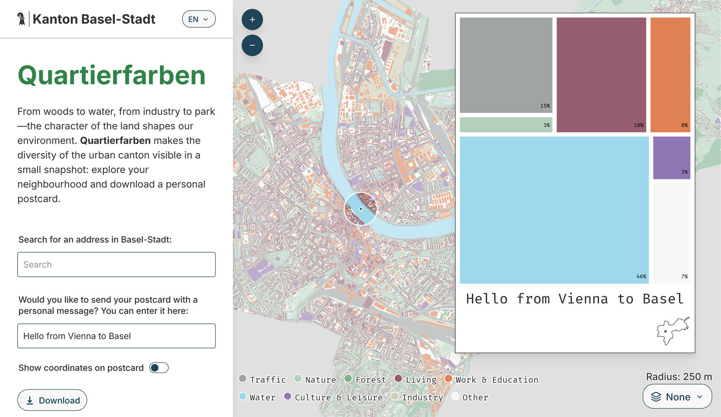
With its own color scheme, corporate design, and new features like an inset map on the postcard, automatic neighborhood-based labeling, and multiple basemaps to choose from, it shows how open-source collaboration can benefit everyone. The Statistisches Amt Basel-Stadt has also published the visualization in their statistical dossier (April 2026) and as posters around the city, offering a postcard printing option at events. It’s wonderful to see this project spread and evolve.
If you want to build such a web app for your own city, make sure to check out our GitHub repository and reach out if we can support you.
Would you like to see the maps that our students have created? Here, you can view in detail the maps they created for the Project Map Creation course this year, which was supervised by Manuela Schmidt and Camila Narbaitz Sarsur. Enjoy your visit!
What a semester. Wednesday 25.06.2025 was a day of celebration as we held the farewell ceremony for all our wonderful cartography students!
Students of the 14th intake of the International Cartography Master
It was also the occasion of the annual map exhibition, where students present their semester-long projects. As part of the Project Map Creation course, supervised by Manuela Schmidt and Camila Narbaitz Sarsur, each student had the opportunity to create a unique map using the techniques of their choice. And, wow, what great projects!
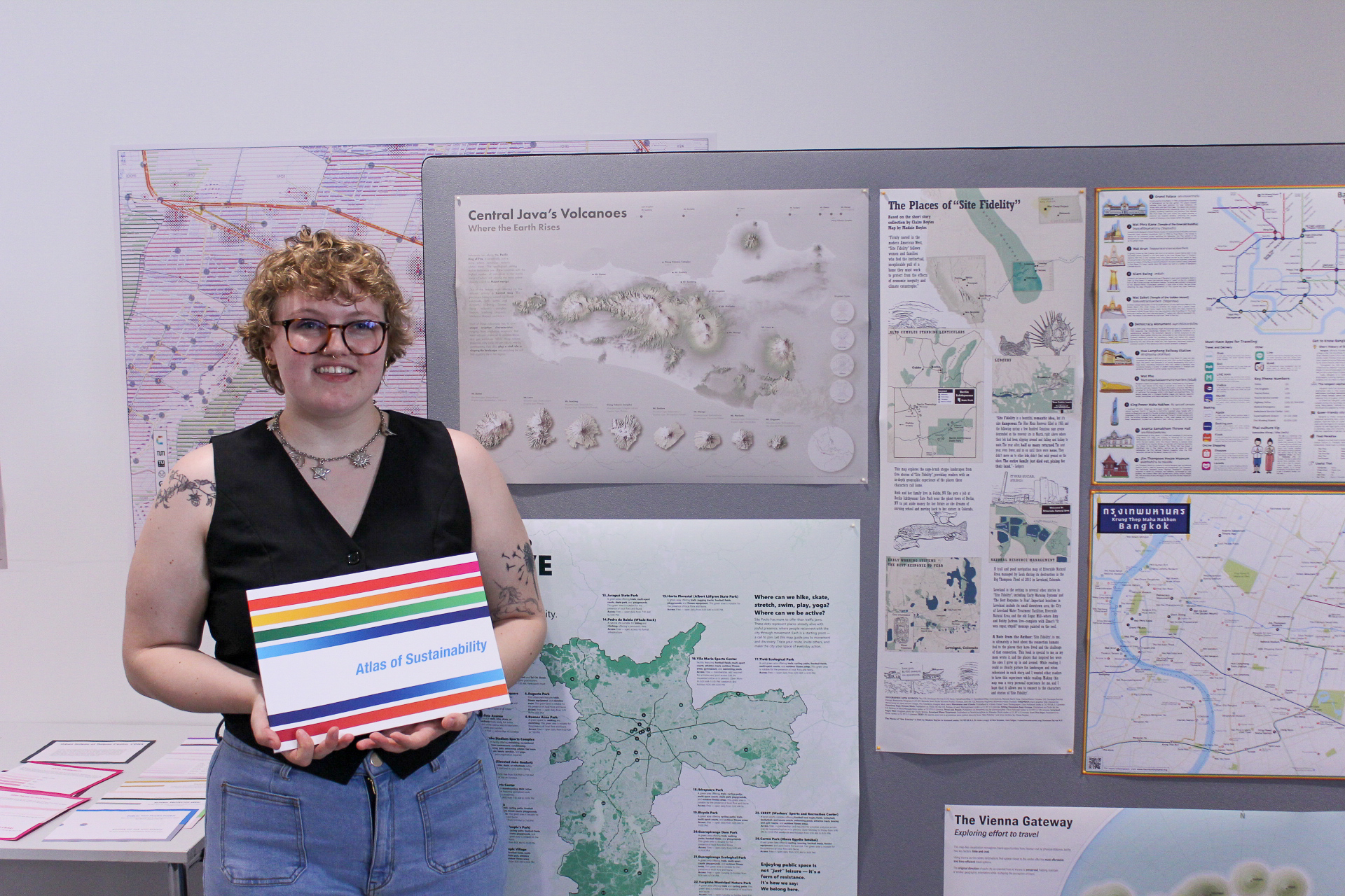
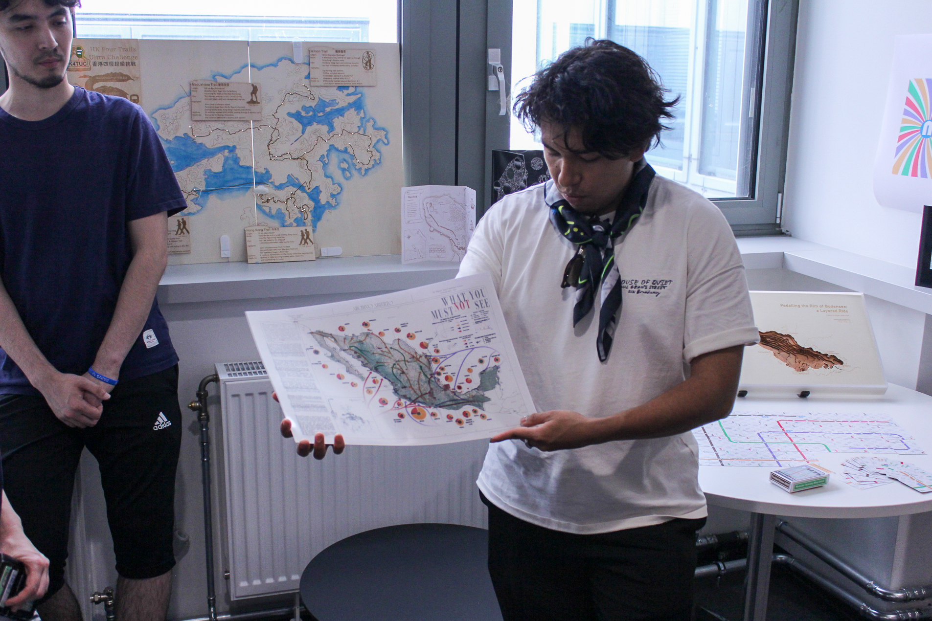
Madeleine and her map “The Places of ‘Site Fidelity’ “Miguel and his map “What You Must (Not) See”
We wish all the best to the students for their next semester, at TU Dresden, and for their cartographic career!
Our student Juliette Bricker has won the Arthur Robinson Award for Best Printed Map in the 2024 Map Design Competition organized by the Cartography and Geographic Information Society (CaGIS) for her outstanding work called “Wien 360 (Vienna 360)”.
This prestigious award recognizes excellence in maps or map series created specifically for print or static media. As part of this honor, Juliette’s map will be added to the Library of Congress collection.
Juliette designed the “Wien 360 (Vienna 360)” map during her second semester in the MSc Cartography program at TU Wien, as part of the course “Project Map Creation”. The map was also showcased at the “EuroCarto 2024” conference.
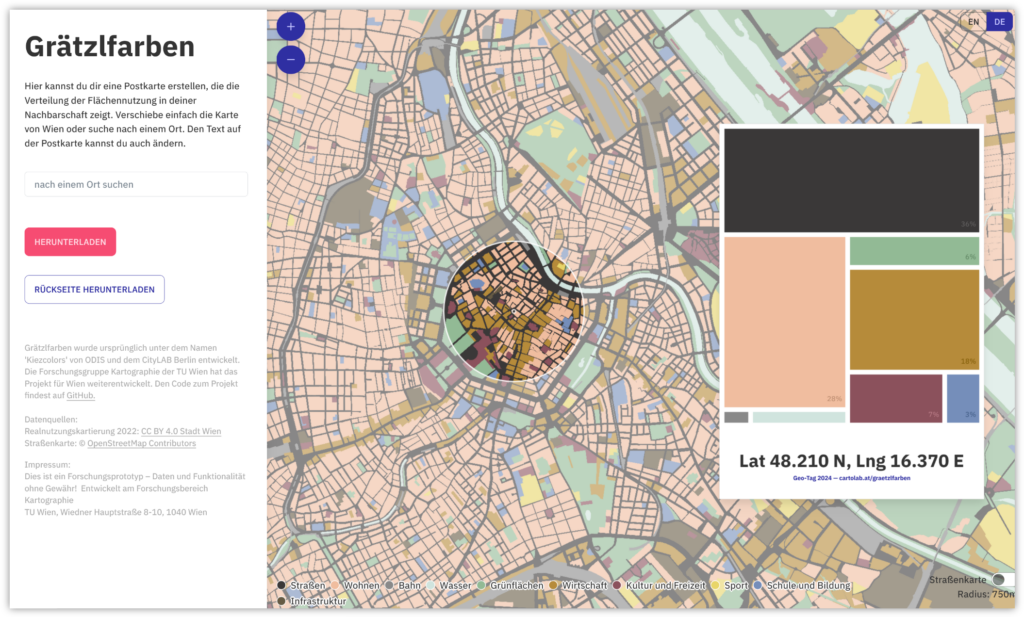
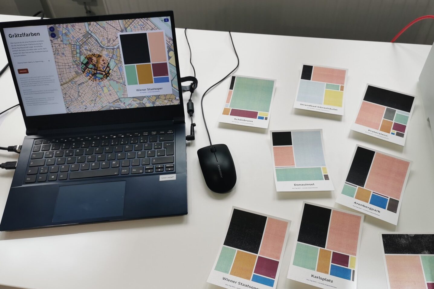
In cities like Vienna, different uses compete for land. But what uses actually take up how much space? And what is the distribution in your Viennese neighbourhood?
In our Grätzlfarben app you can explore the distribution of land use in Vienna and create and print a postcard visualizing the land use in your neighbourhood. The map is based on an open source application by the Berlin-based Open Data Informationsstelle. We have adapted it for Vienna, using open government data from the City of Vienna and giving it a new look with different colours.
We first presented this application at the GEO Day in April this year, the open day of the Department of Geodesy and Geoinformation at the TU Wien, where we talked with school kids about the variety and partiality of maps. Since then, we have continued to develop the application to make it easier to implement for other cities. Our code, like the original code, is published on GitHub and can be adapted to any other city that provides a suitable open dataset. We’re looking forward to seeing Grätzlfarben for your city!
Are you wondering what the title of the project is about? It is directly inspired by the original ‘Kiezcolors‘. Neighbourhoods or small districts in Berlin are called ‘Kiez’, while in Vienna we call them ‘Grätzl’. Since the city-specific application with the colourful postcard format brings the information to a local and large-scale level, we decided to go with this local reference.